
A well-designed navigation structure doesn’t just improve usability; it builds trust, encourages exploration, and increases the likelihood of conversions. By investing in intuitive navigation, you’re investing in customer satisfaction and retention. Let’s work together to make your ecommerce store an inviting, easy-to-navigate destination that keeps users coming back.
Get ready for Black Friday - we offer an audit of your Shopify store. Just send an email to vlad@stellar-soft.com or jack@stellar-soft.com and we’ll take care of your online business!
NewsDigital DesignDesignEcommerceShopify
User-Friendly Ecommerce Navigation
Navigating the Digital Landscape
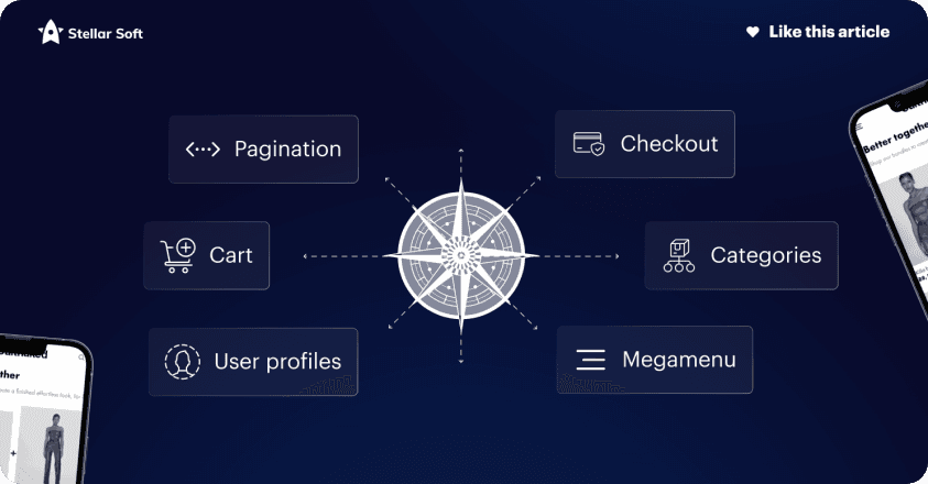
Imagine your website’s navigation as a compass — one that guides users across a sea of product options. Effective navigation empowers users, helping them find what they’re looking for without confusion or frustration. Here’s how to design a navigation system that’s both user-friendly and optimized for sales:
Key Ingredients for Success
1. Simplicity is Key
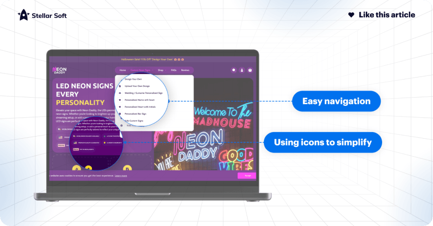
Keep things simple. A clean, organized navigation bar is inviting and functional, making it easy for users to understand your product categories. Avoid overloading users with choices; instead, group similar products together logically.
2. Clear Labels and Descriptions
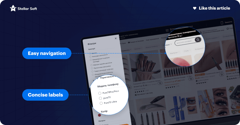
Make sure your labels are straightforward to understand. Instead of jargon, use language that resonates with your target audience. By anticipating their needs, you’re making their journey more intuitive.
3. Visual Cues and Signposts
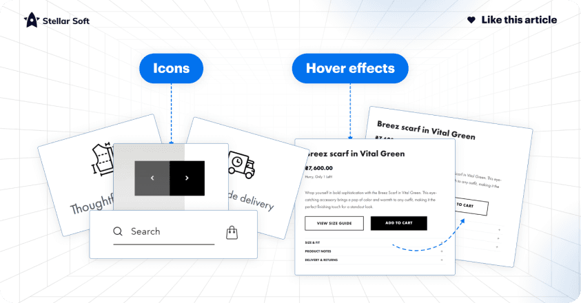
Enhance usability with icons, hover effects, and other visual cues. These elements help users navigate your site more efficiently by highlighting clickable areas and providing feedback when interacting with dmplicity is Keyifferent parts of the page.
4. Responsive Design
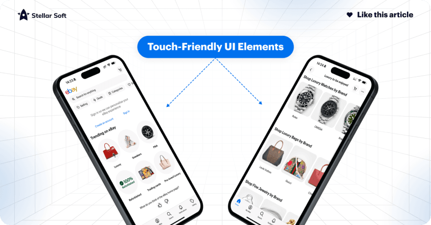
In an era where shopping happens on the go, your navigation must work seamlessly on any device. Whether users are on a desktop, tablet, or mobile phone, your navigation should adjust smoothly, maintaining a consistent experience.
Examples of Stellar Navigation
To truly understand how navigation can enhance the user experience, let’s take a look at some ecommerce giants and their approaches to navigation:
1. Amazon
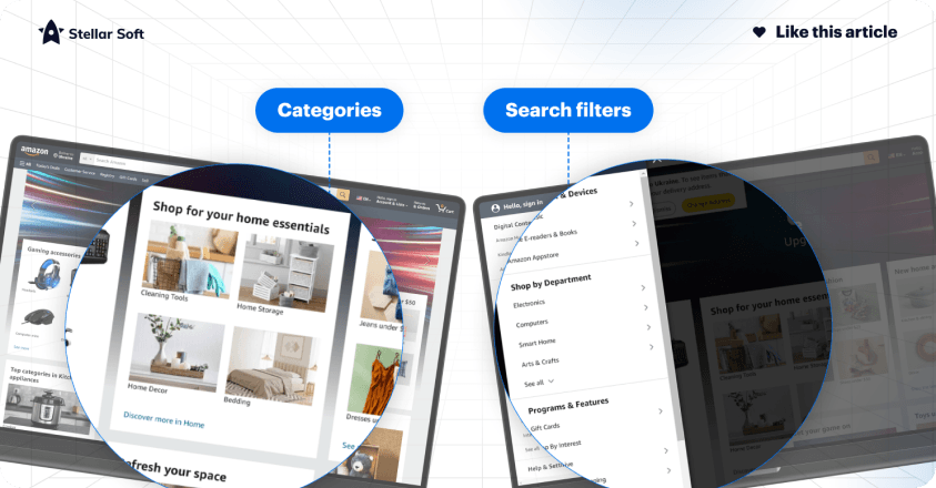
Amazon’s straightforward, minimalist navigation allows millions to browse through vast product categories with ease, proving that simplicity can be incredibly powerful.
2. Apple
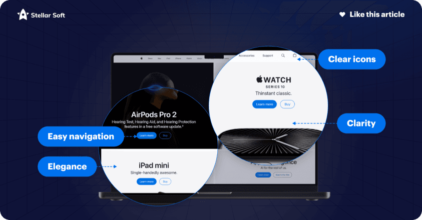
Known for its clean and elegant design, Apple’s navigation is a masterclass in directing users intuitively to its array of products and services without any distractions.
3. Etsy
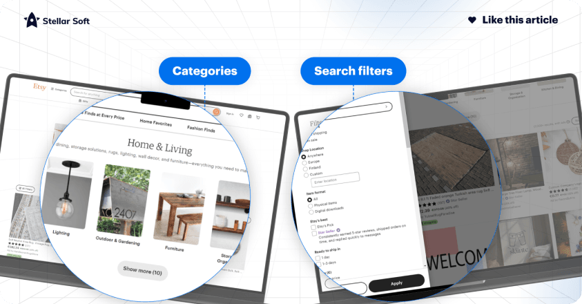
For a site packed with unique, personalized items, Etsy’s curated categories and search filters help users explore a massive range of products easily.
4. Zappos
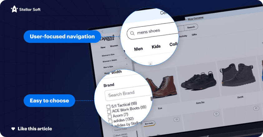
Zappos has a highly user-focused navigation system with well-organized categories and powerful filters, allowing customers to narrow down options by brand, size, and style effortlessly.
5. Nike
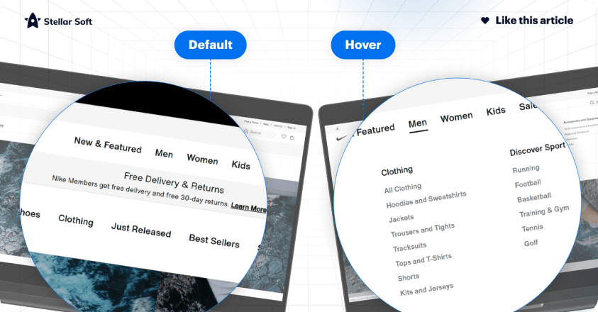
Nike's website showcases clean, visually compelling navigation. With options like “New Releases,” “Men,” “Women,” and “Sale” displayed prominently, Nike ensures users can quickly find their desired products.
6. Sephora
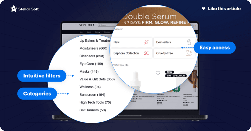
Sephora’s navigation is built around intuitive categories and filters that cater to beauty enthusiasts, offering easy access to products by brand, ingredient, and even customer reviews. The "Find Your Match" tool further enhances the user experience.
7. Zara
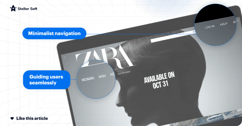
Zara combines simplicity with functionality, providing a minimalist navigation menu that prioritizes categories such as “Women,” “Men,” and “Kids.” It’s stylish yet straightforward, reflecting the brand’s aesthetic while guiding users seamlessly.
Take the Leap: Transform Your Store Today!

Zara combines simplicity with functionality, providing a minimalist navigation menu that prioritizes categories such as “Women,” “Men,” and “Kids.” It’s stylish yet straightforward, reflecting the brand’s aesthetic while guiding users seamlessly.