

With mobile shopping becoming more and more common, consumers feel more at ease making purchases straight from their phones these days. In terms of user experience (UX), optimizing Shopify mobile speed needs to be one of your first concerns if you want to increase revenue. The following are the main reasons why:
Expert ArticleShopifyDigital DesignFront-endDesignDevelopmentMobile
Implementing Mobile-First Design in Your Shopify Store
- A significant portion of ecommerce revenues will come from mobile shopping, which is expected to reach $856 billion in the US market by 2027 [1].
- According to recent research, roughly 76% of respondents have used their phones to make transactions [2].
Except fast load speed, ensure all the UX assets driving conversions are consistent across your website: effortless navigation, high readability scores, and adaptive interface elements. This article offers advice on how to make a mobile-first design and how to give users an experience that is on par with desktop ones.
Importance of Mobile-First Design in Ecommerce
Mobile-first design entails tailoring your site for mobile devices exclusively before creating a desktop version. It’s particularly significant during the initial stages of development [3].
The user experience is improved with touch-friendly interfaces - they make navigating easy and intuitive. In order to avoid unintentional clicks, buttons must be in size enough to comfortably tap and there must be space between clickable objects.
Clear navigation and clearly accessible menus are essential. Adding features: "back-to-top" buttons or sticky navigation bars can make it easier for people to navigate the website. Whatever device your customers use (e.g., tablet, phone, or desktop), they’re used to scrolling through products that they can access on any device. However, that is not all.
Mobile Responsive vs Mobile-First Design: What’s the Difference?
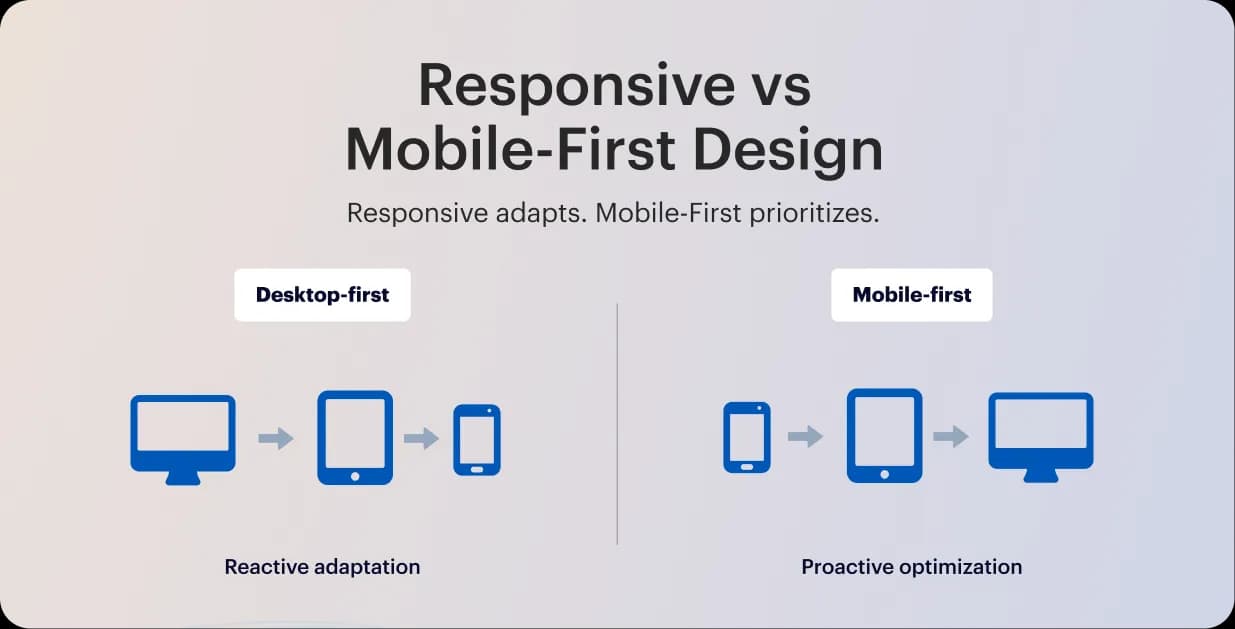
The primary distinction between mobile-first and responsive web design is how the designer approaches the website. Reactive by purpose, a responsive site adapts to different devices flawlessly. When the desktop and mobile sites are created simultaneously, with proactive design optimization made to ensure the mobile experience is as responsive as the desktop.
The problem with mobile responsive design is that it only reformats the same content to fit any kind of device; it is not adequately optimized for mobile. This is helpful, sure, it may lead to an imbalance in solid desktop sites and unwieldy mobile versions. It’s implied by the fact that responsiveness typically begins with the desktop and then adapts it to other devices.
From here graceful degradation stands in stark contrast to progressive enhancement. This is the more popular approach of beginning with the more sophisticated desktop version and then removing features to make it compatible with less sophisticated browsers, like mobile.
Following the route of progressive enhancement and at the same time committing to mobile-first design seems reasonable given how encouraging mobile is becoming.
Why to Prioritize Cross-Device Navigation?
The user experience is significantly improved by a well-designed navigation panel, which makes it simple for users to locate the precise information they require. Users can access content or items more quickly when navigation is clear and organized, which lowers bounce rates.
If users can easily find what they're looking for, they're more likely to stay on the site, do more exploring, and possibly become customers. Improved cross-device usability, more time spent on the site, and higher conversion rates are all results of a simple, intuitive navigation system.
To create a seamless experience for all-device users, ensure the following:
- Intuitive layout: To make it easy for customers to locate what they're looking for, keep the menu straightforward with distinct labels and well-organized sections.
- Positioning: To ensure that users know where to find the menu on each page, place it consistently, usually at the top or side.
- Responsiveness: Combine tappable elements with scrollable information, and use dropdowns or a hamburger menu for mobile views to keep users interested and prevent them from leaving during navigation.
- Accessible design: For seamless surfing, including keyboard navigation and screen readers, ensure your menu complies with WCAG and the European Accessibility Act.
To summarize, cross-device users should only need to tap to access the navigation bar when perusing or contrasting several products. Every device and screen size should be able to use the navigation bar without any issues.
Benefits of Mobile-First Approach
Since the majority of consumers are dependent on their mobile devices, it should be obvious to embrace the mobile-first mindset. Even still, there are certain restrictions and warnings, so not all designers are inclined to use this strategy. We'll go over the benefits of this design approach next, so you can decide for yourself whether or not to implement mobile design.
SEO advantages
Search algorithms look at the mobile version of your website when determining where to place you in search results because they use mobile-first indexing. Even if your content is excellent, your SEO will suffer if your Shopify store design isn't mobile-friendly.
Designing for mobile first benefits tiny brands:
- Boost page speed, which affects Google ranking.
- Improve metrics for user engagement
- Boost exposure on mobile searches
Users stay on your site longer when it loads faster and is easier to navigate, and Google interprets this as an indication of quality. You should consider cross-device compatibility.
Conversion optimization
Any ecommerce store's objective is to turn visitors into customers. Here, mobile-first design is crucial. Without having to zoom in or become irritated by sluggish buttons, it makes it simpler for consumers to finish tasks like adding things to their cart or checking out.
Shopify research indicates that mobile-optimized stores have greater mobile conversions than non-mobile-optimized ones. Every sale matters for tiny brands. Over time, a minor enhancement in mobile usability can result in a significant rise in revenue.
How to Implement Mobile-First Design in Shopify
A responsive Shopify design offers a smooth shopping experience by dynamically modifying your store's layout according to the device being used. When creating your next digital product, use these best practices for mobile-first design.
1. Find a mobile-responsive theme
The first step in developing a store that prioritizes mobile devices is choosing a mobile UX Shopify theme that is responsive to mobile devices. Shopify has a number of themes that are optimized to look fantastic on desktop and mobile devices. Keep the following in mind when selecting a theme:
- Quickness of Response: A theme should be able to adapt to various screen sizes without losing functionality.
- Options for Customisation: Seek themes that let you alter layouts, fonts, and colours to reflect your own style.
- Customer Evaluations: To evaluate the functionality and performance of the theme, look through user reviews and ratings.
To locate a theme that works for you, go to the Shopify Theme Store and utilize the filters to only see themes that are responsive to mobile devices.
2. Avoid pop-ups or banners to advertise
Do you fear white spaces? Compared to a congested mobile site, it's a safer option. When used properly, white space may highlight things or serve as a guide for users. To contrast your white space, use dynamic graphics and vibrant, vivid colors. This will contribute to a clear, simple, and navigable website.
Pop-ups and banners should be avoided while creating mobile-friendly websites. This is because they occupy a significant amount of valuable screen real estate on mobile devices.
Additionally, pop-ups and advertising make it exceedingly hard for customers to use your product. It may cause disturbances and raise your bounce rate. If your website uses obtrusive pop-ups on mobile devices, search engines like Google may punish it.
3. Focus on speed and performance
Page load time is an important aspect in user experience and SEO. Mobile customers are constantly on the move and may abandon a site that takes too long to load. Here is how to improve your store's speed:
- Optimize Images: Compress photographs to minimize file size without compromising quality. To further enhance download times, choose the suitable image format (JPEG for photographs, PNG for graphics).
- Minimize Apps: Each app you add might cause your site to slow down. Evaluate your installed apps and eliminate those that you don't require.
- Using a Content Delivery Network (CDN): Shopify makes use of CDNs to speed up content delivery. Make sure that your store is using this feature to boost performance.
Also consider that too many redirects can slow down your site. Keep them to a minimum to enhance loading speed.
Mobile page load times may be greatly reduced by using additional strategies like code minification, lazy loading, and image optimization. Google offers data and suggestions for enhancing website performance through its PageSpeed data and Lighthouse products.
4. Design for touch interactions
Unlike desktop users, mobile users generally utilize touch to engage with websites. Keep the following touch-related factors in mind while creating your Shopify store:
- Button Size: Make sure the buttons are big enough for a finger to tap them effortlessly. A minimum size of 44 by 44 pixels is advised.
- Spacing: To avoid unintentional clicks, leave enough space between buttons and links.
- Vertical Scrolling: Scrolling vertically is a habit among mobile users. Instead of requiring horizontal scrolling, stack items in your layout to capitalize on this.
Must to try: Place finding menus and important buttons near the bottom of your website to provide a touch of simplicity.
5. Use clear Calls-to-Action (CTAs)
Customers are guided throughout your business by effective CTAs, which also encourage them to do certain activities, such as adding items to their cart or signing up for your newsletter. To create compelling CTAs:
- Remain Concise and Action-Oriented: "Shop Now," "Add to Cart," or "Subscribe Today" are examples of clear, practical marketing language.
- Use Vibrant Colors: To draw attention to your calls to action, choose colors that contrast with the rest of your design. This encourages clicks and generates attention.
- Strategic Position CTAs: Your calls to action (CTAs) should be placed in prominent areas of your website or at the end of product descriptions, where customers are likely to see them.
Without using a mouse, scroll effects and hover control are really useless. Choose simple methods to provide this information instead, such as arrows or directional messages.
Testing Your Shopify Layout Across Devices
Make use of data to direct your continuous optimization. Segment the performance by device in Google Analytics or Shopify Analytics. Track metrics like average order value on mobile versus desktop, bounce rate, and mobile conversion rate. Look at where users fall off in the funnel if you observe, for instance, that mobile conversion is much lower. Certain mobile pages may require redesign or speed enhancements if their bounce rates are high.
Here are the key points where continues testing and mobile performance optimization must be attentive:
By using these tactics, you'll create a Shopify store that works flawlessly on mobile devices and looks great, increasing customer happiness and possibly increasing sales.

Common Pitfalls to Avoid
When applied to desktop screens, mobile-first web designs may unintentionally impair usability and navigation. Desktop users frequently utilize a mouse and keyboard for navigating, but mobile users are used to swiping and tapping. The precision needed for mouse-based navigation on larger screens might not be easily achieved by the design features intended for touch interactions on mobile devices.
While optimizing for smaller mobile screens enhances accessibility, mobile-first web design may inadvertently compromise functionality and layout displaying on desktops. The root cause lies in the fundamental differences in screen sizes, aspect ratios, and user interaction models, which, if overlooked, limit the overall effectiveness of cross-platform experiences.
Conclusion
The fundamental requirement for ecommerce success is constant despite the rapid changes in global technological trends: providing a first-rate user experience is essential to increasing revenue, customer loyalty, and brand recognition. Your Shopify themes customization with Stellar will be inclusive, grant rapid loads, and assist users in finding what they're looking for. The best method to accomplish these objectives is to use a mobile-first strategy.
References
- https://www.designrush.com/agency/ecommerce/trends/ecommerce-statistics
- https://www.consumeraffairs.com/cell_phones/cell-phone-statistics.html
- https://www.shopify.com/partners/blog/mobile-first-design